.png)
Sakara
Redesigning Sakara’s E-Commerce Platform
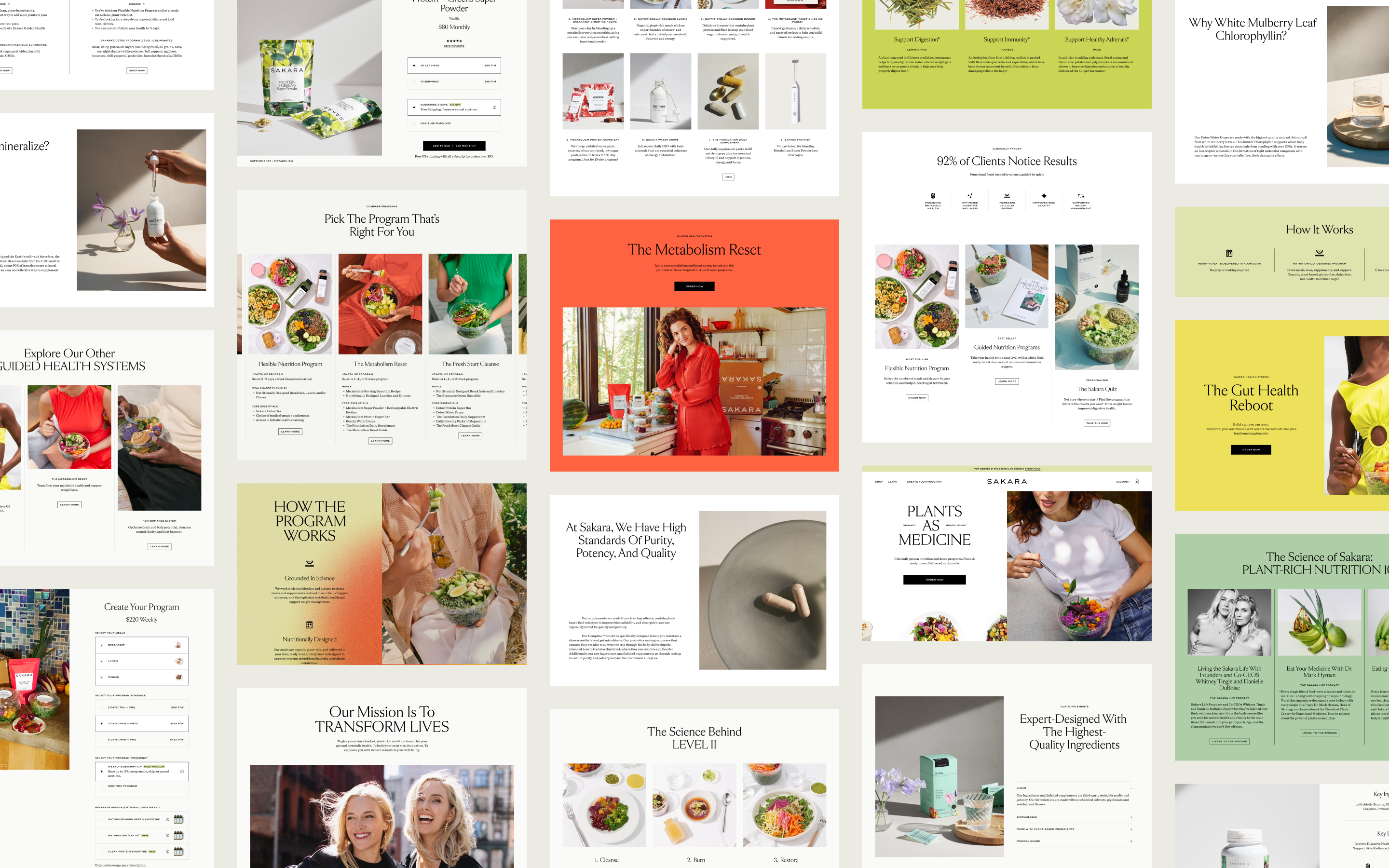
The new Sakara website is a beautifully curated storefront that highlights the company's ethos of Science and Spirit. From in-depth discoveries that put a spotlight on the Power of Plants, to visually exciting product showcases, the website aims to empower, educate and act as an entryway into the Sakara Life.
The Challenge
Sakara has been using the same Shopify website platform since the company’s inception. Though the business grew in scale and has garnered millions in revenue, the website has struggled to keep up with the company’s growth and, as a result, patchwork and hard-coded solutions were made with no room for flexibility and scalability. The current website is a mix of legacy designs and code along with attempts at modernizing the site, with inconsistencies everywhere.
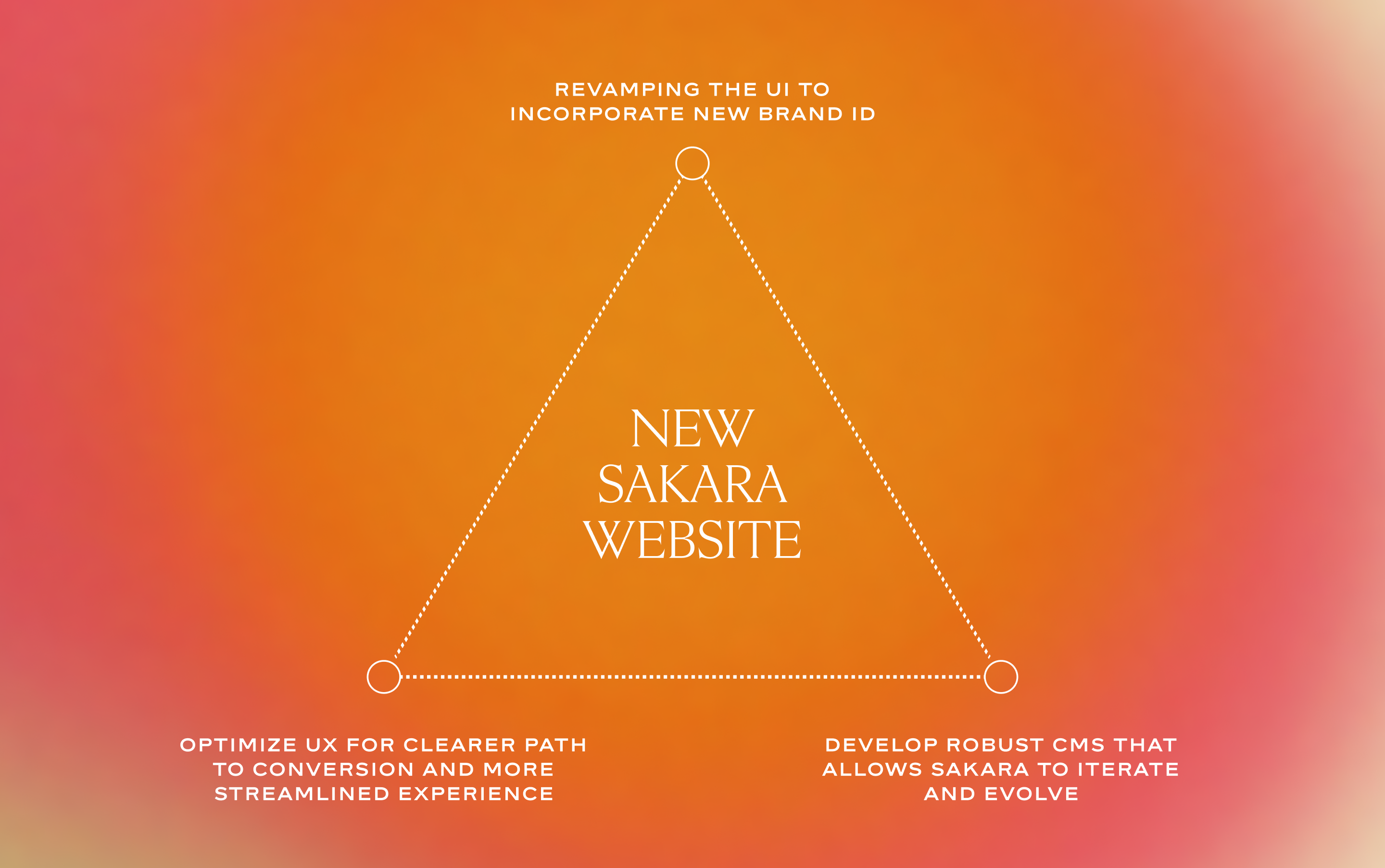
With an E-Commerce platform of this scale, there were an innumerable amount of things to fix, but our primary goal was to overhaul the UI/UX, maximize conversion opportunities and to also enable Sakara the flexibility to grow and innovate the platform post-launch.
My Role
I was immediately placed into this project upon joining Sakara, and coordinated closely with an external agency that was hired to help build the platform on Sanity's CMS. I worked with a number of people across multiple cross-functional teams to ensure that the site was set up for success on all business fronts. My responsibilities were as follows:
- Design and Direction
Created wireframes, prototypes and high fidelity versions of the designs, and artworked them for Dev handover. Guided the implementation of UI/UX best practices, as well promoted the use of a Design System in order to maximize the usability of the incoming CMS and allow for easy iteration and future-proofing. - User, Market and Design Research
Coordinated with data analysts as well as cross-functional teams (marketing, acquisition) to gather information and develop a clear strategy on what we needed to do to enhance user engagement, reduce bounce rate, churn and increase conversions. - Collaboration and Management
Worked extensively as a liaison for the key stakeholders, navigating the line between the desired outcomes whilst retaining the vision of the company's founders. Often resolved conflicts between visions and aided in fostering a collaborative environment conducive to innovation and progress.
Research and Validation
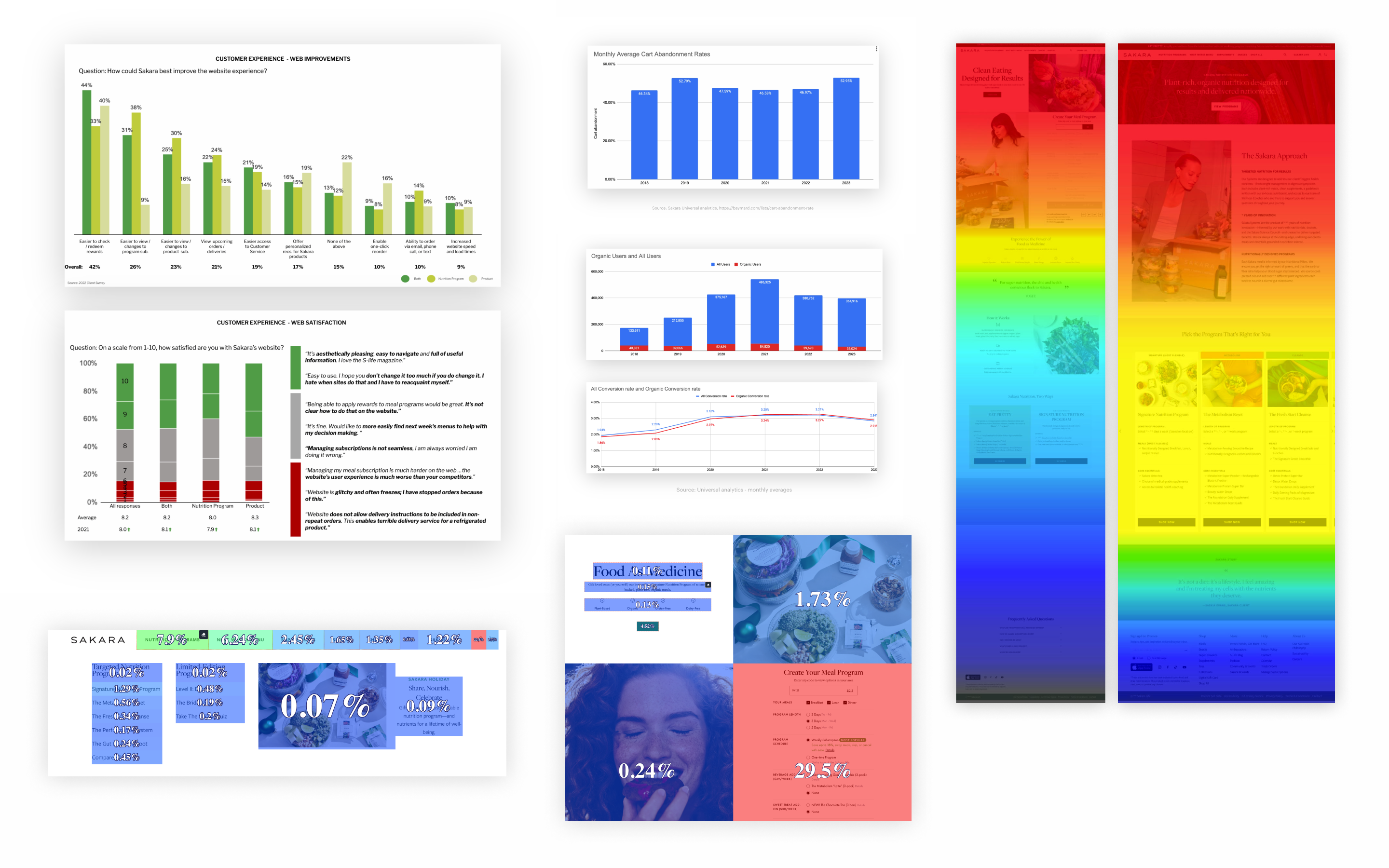
With a combination of User Testing, analytics, and gathering key data from cross-functional teams around Sakara, we discovered pain points, areas of improvement and were able to build a strategic roadmap on what was needed to get the Sakara website to where it needs to be. A few points of focus were unearthed for the design:
- Mobile First
With 74% of site traffic coming from mobile, it was important to establish a best-in-class experience to reel in customers, provide clear value propositions and to entice them to convert. - UX Improvement and Optimization
The feedback from our User Research showed a real need for simplification and signposting. Due to the wealth of complex information posted on the site, it was clear that we needed to streamline the design to reduce confusion, highlight benefits and funnel them into the desired purchase flow. - UI Uplift for a Consistent Experience
The UI of the website contains elements from 3 different brand IDs that were developed over the course of the company's existence. Due to the use of legacy tech, it was difficult/impossible for the company to update the entire site as new ID versions were released.
Keys for Success
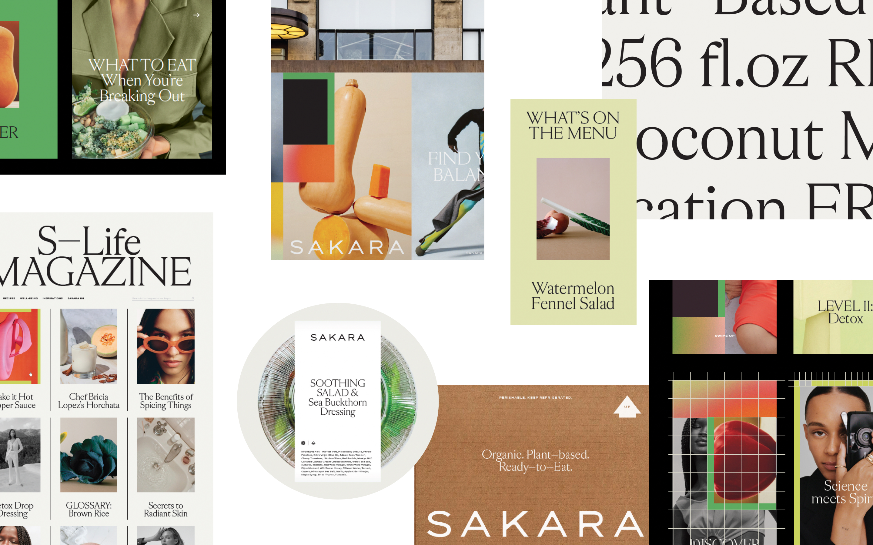
Through strategic design choices, we wanted to transform the website into a captivating digital showroom. With engaging storytelling, visually stunning content and layout design, we want to paint a vivid picture of the company’s value proposition. We wanted to welcome users into an immersive experience that would foster a deeper connection with the brand.
UI Goals
For the UI, we needed to create a fully fleshed-out Design System that is flexible and dynamic, ensure that the design meets accessibility standards, and reflects the "high-end", "lifestyle" and "editorial" feel of the brand.
UX Goals
For the UX, we needed to simplify by removing unnecessary complexities and redundancies, streamline the conversion funnels to make the purchase process easier for users, and create more avenues and signposting opportunities to better guide and direct users to the desired destinations.
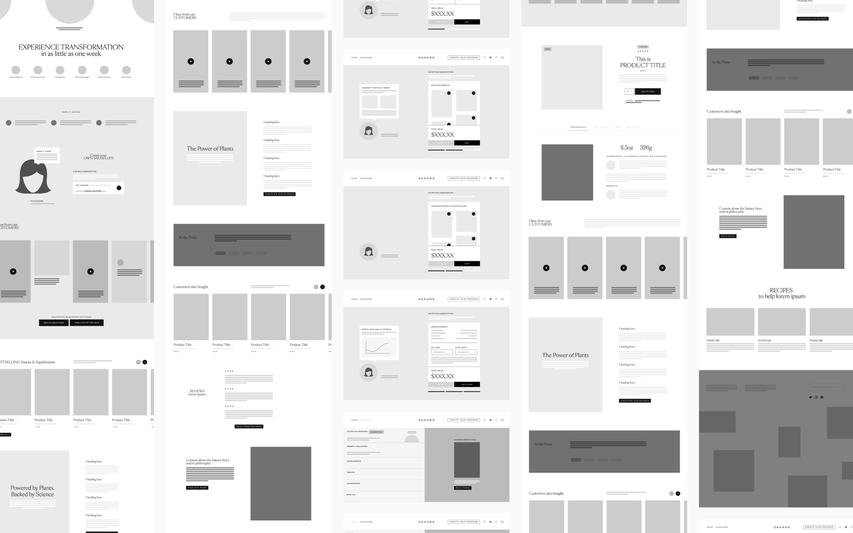
Wireframing & Sketches
With the key goals outlined, we began crafting out a lo-fi solution of the design, with the aim of resolving all of the current issues that affected the existing website. By using simplified outlines, we were able to remain agnostic to the UI design, maintain an agile workflow and allow the key stakeholders a level of focus to the specific challenges that needed to be solved.
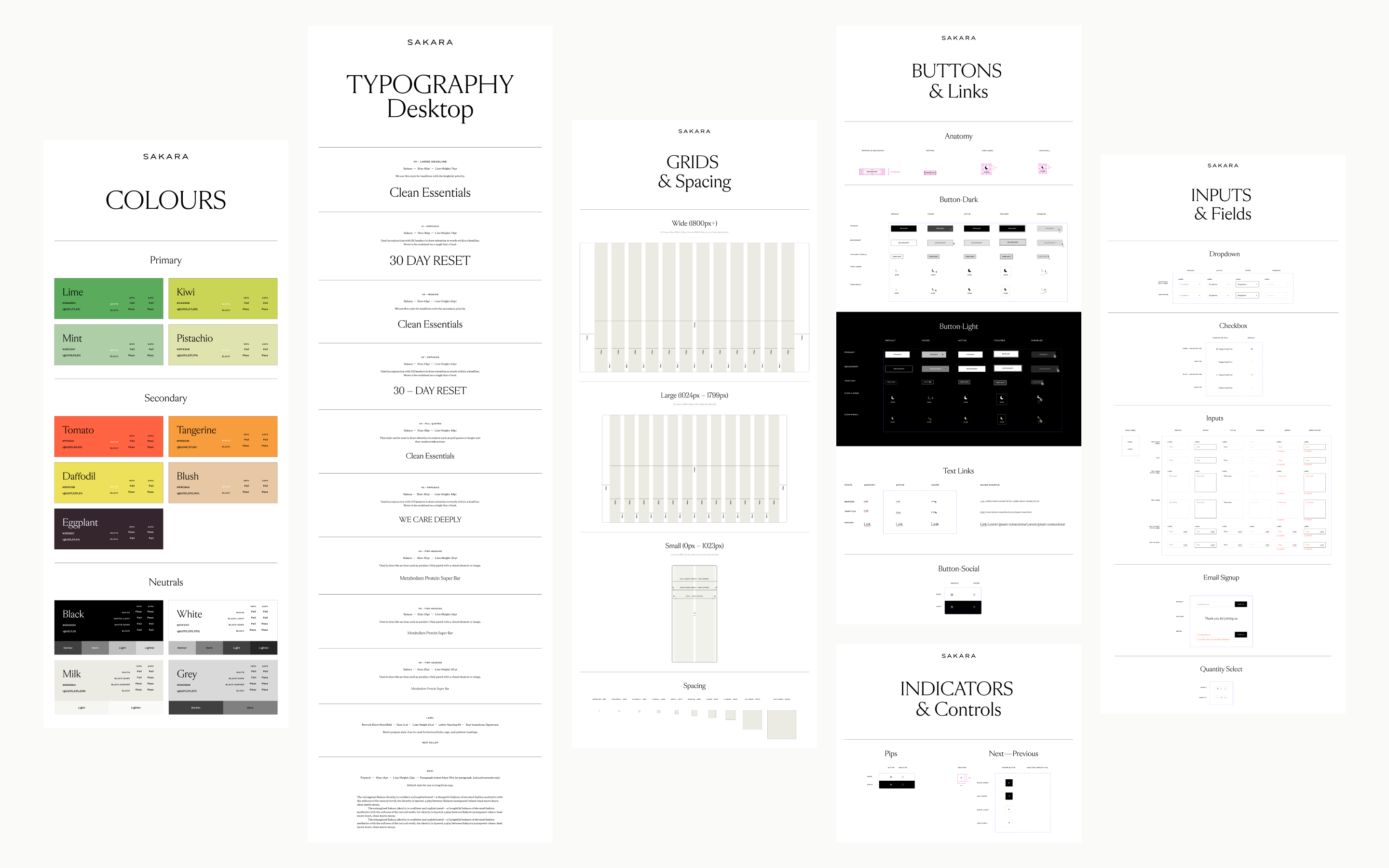
Crafting the Design System
Because Sakara had an already established Brand ID, my job was to translate the Brand Book to a digital space, allowing it to retain Sakara's signature identity whilst retaining a high level of accessibility, usability and scalability on all platforms. Once the Design System was built, we had the framework necessary to building a consistent, flexible and successful product. Click here (pw: MSPortfolio) to see the finalized Design System.
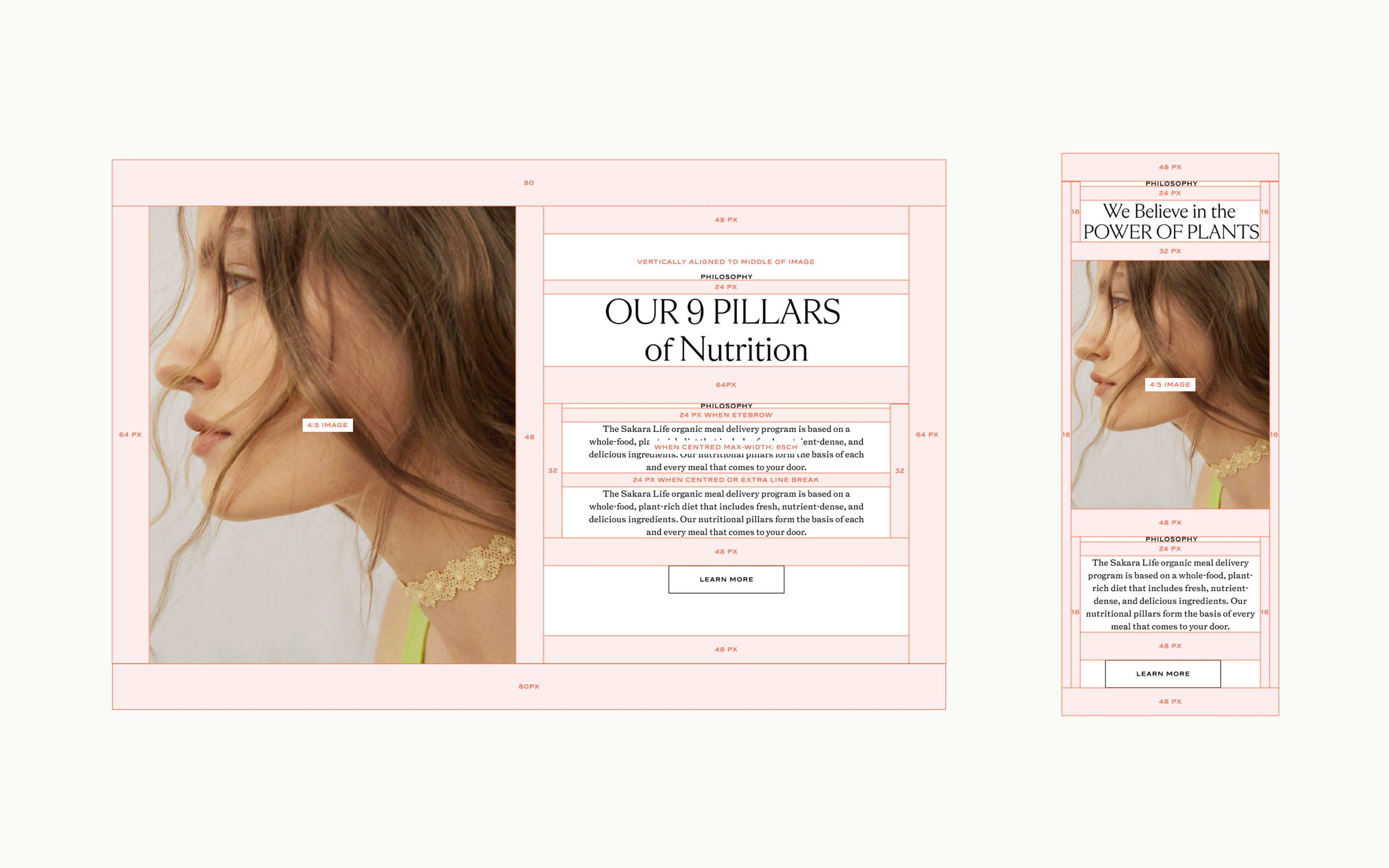
Going Full Modular
With the wireframes built and the Design System established, we had the necessary tools to build out the design. With Sakara's current platform utilizing legacy tech and an overcomplicated tech stack, we needed to make sure that the resulting designs were flexible, scalable and easy to implement with the Headless CMS platform that we wanted to replace our current system with.
With that in mind, we built a fully modular system that allowed us the flexibility to create any page we wanted with any combination of modules that were created for the site. All of the modules were designed to cover every possible eventuality and we made sure to validate the design choices based on the initial research we've done and confirmation from what other cross-functional teams in Sakara needed for future campaigns and initiatives. We wanted to ensure that we avoided hard-coding anything and that the designs were future-proofed.
Once the modules and designs were approved, we artworked them for the Engineering team to ensure that the design will be built as intended.
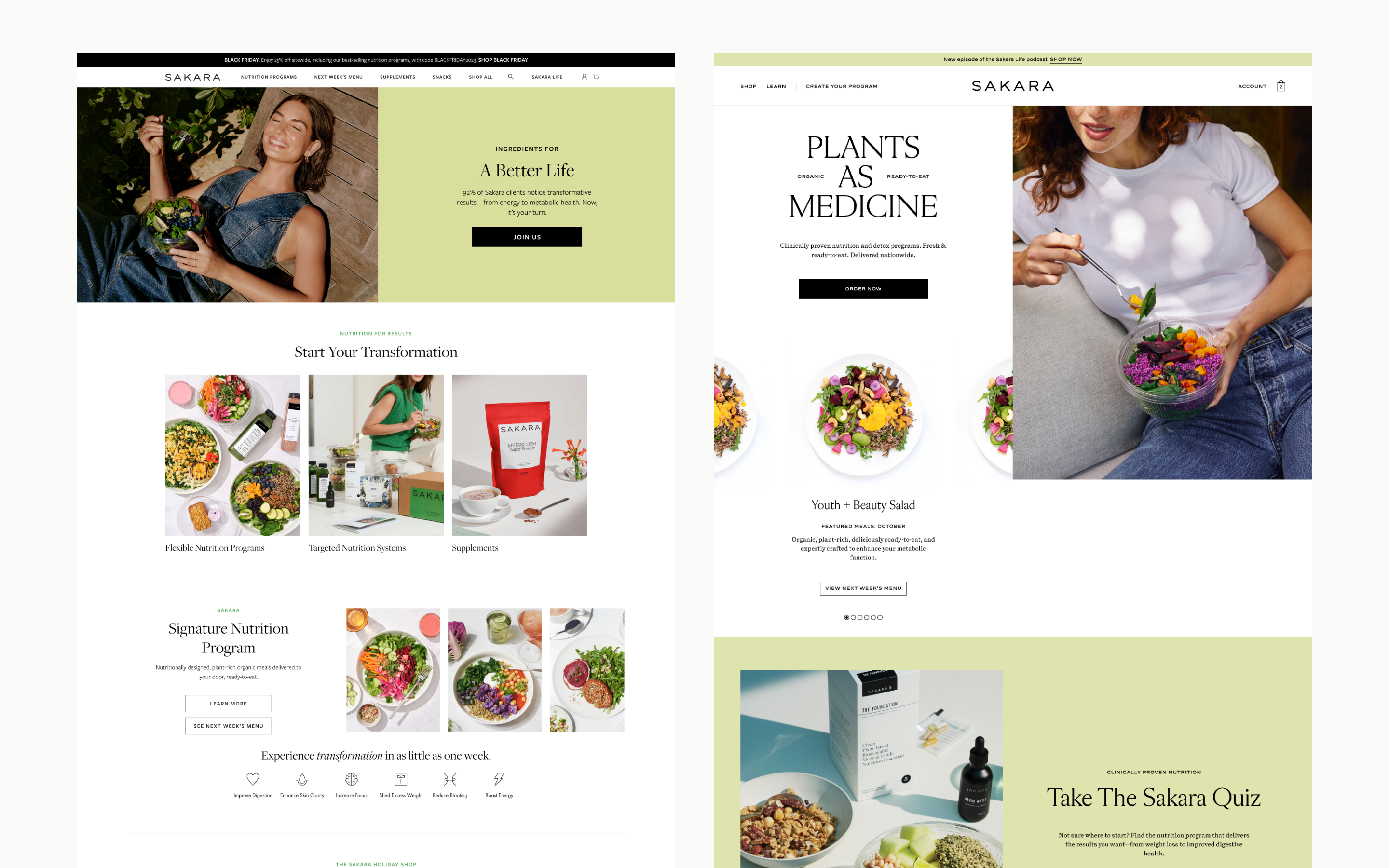
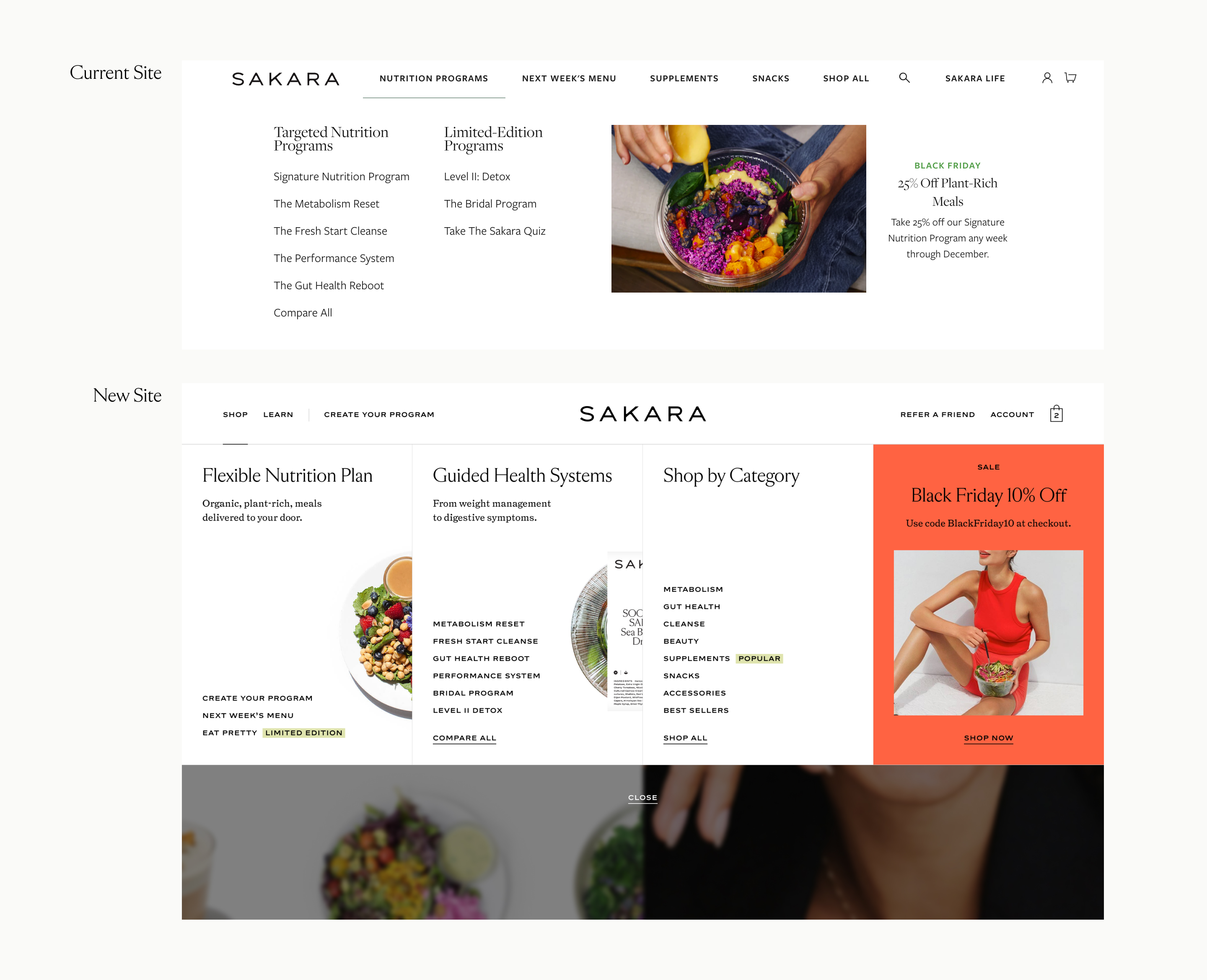
Key Improvements - Homepage
- Surfaced Next Week's Menu
With 16.5% of Homepage clicks leading to the Next Week's Menu page, we wanted to place it higher within the page hierarchy. Our design provided a quick "sneak peek" of the menu, highlighting the beautiful food photography of Sakara's meals, enticing users to click into the link to see the wealth of options that Sakara's menu provides - More Direction, More Engagement
We created more funnels and opportunities that could direct high-intent users to explore the brand more and ultimately convert. The previous site didn't have that level of directionality so we needed to create an environment in the Homepage that will allow for increased conversion opportunities. We also designed more avenues where users can engage with the site's content and discover more about the product catalogue and its benefits - Inspire, Welcome, Educate
A major strength Sakara carried was with its value propositions and brand. The new design provides more platforms where Sakara can demonstrate its scientific prowess and how it relates to the company's product lineup. There are now spaces where users can see more social proof/validation, links and references to articles that support Sakara's value proposition, and a design that gives users a sneak peek on what it's like to live the Sakara Life
Key Improvements - Navigation
- Simplify and Streamline
The current navigation contains a lot of redundant links that all lead to the same page and is not optimally organized to guide users to the desired funnels. Through our audits of the Information Architecture and implementation of Navigation best practices, we were able to create a more defined navigation that provides a clear scope for users coming into the site. - Keep Popular Areas Surfaced
By referencing the research we conducted, we made sure to keep frequently clicked links surfaced at the first level to accommodate common user behaviors. Things like Login/Account (27% Click Through Rate), Next Week's Menu (22% Click Through Rate), and Signature Meal (11% Click Through Rate) were kept highly visible to ensure that we're not confusing regular users whilst instilling these common behaviors to incoming users. - Educating Users
In User Testing, we found that the navigation was a source of information for users to understand and differentiate the products on offer. In discovering that, we attempted to have the navigation include some form of education so that customers can make an informed decision at the navigation-level.
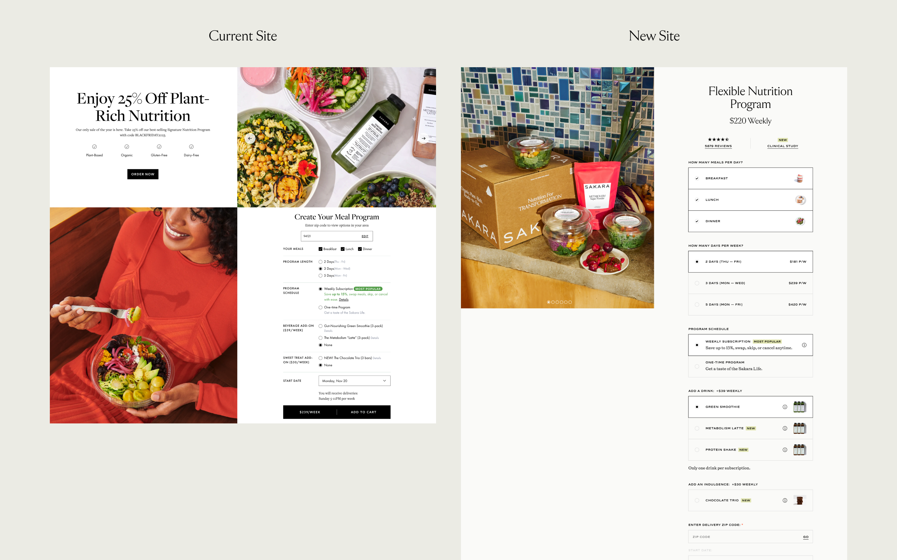
Key Improvements - Signature Nutrition Program and Meal Systems
- Upgraded Order Widget
As Sakara's highest selling product, one of the key things to get right was to ensure that the Order Widget functioned seamlessly and followed UX/UI Best Practices. The current Order Widget had a wealth of problems (UI fails accessibility standards, too cramped in an attempt to "fit all the content in one screen", etc.), which we fixed by creating a form that is more engaging, informative, cleaner and easy-to-use. - Highlighting Sakara's Science and Spirit
From our User Research, we discovered that informative modules that educated the user on the scientific benefits of Sakara's products were clicked on 4x more than any other related product information. We surfaced it more as our research highlighted the desired need for this type of content. - Upsell/Cross Sell
With the Signature Program and Meal Systems being the most expensive products in Sakara's catalogue, it was important for us to provide avenues for users to discover the more accessible products that work synergistically with Sakara's programs in order to give them a small taste of what it's like to be using Sakara's products.
Conclusion and Next Steps
Because of the nature of how we designed the site and working with the Agile Methodology, we were able to have the engineering team build the modules as they were approved over the course of our Sprints. As of now, the site has officially launched successfully and we're following it up with a lot of testing to determine the efficacy of our design decisions. Overall, the experience of redesigning Sakara's e-Commerce platform was incredibly rewarding; there was a ton of collaboration, a lot of new discoveries and it was a fun challenge to bring together all these different pieces to create a design that solves Sakara's specific business needs. I'm keen and excited to see the site launch and watch it evolve over the course of its development.