
Sakara Design System
Translating the Sakara brand to a Design System
Sakara's brand identity has always been one of its greatest strengths; through the amazing internal Creative team, the company has built up a brand image and reputation of quality and luxury. Though their brand book has evolved over the years, the brand's positive perception has remained evergreen. However, the brand was never effectively converted to a proper design system for their digital storefronts; as the UI/UX Lead Designer brought on board to help spearhead the website redesign, I was tasked to translate Sakara's complex brand book into a design system that would act as the jumping off point for us to build the designs.
The Challenge
Sakara has faced challenges in maintaining a consistent and cohesive user experience across its digital platforms. Design inconsistencies, inefficient collaboration among teams, and prolonged development times prompted the need for a comprehensive design system. As Sakara was gearing up for a website redesign (view the project here), it was imperative to create a cohesive design system that would act as the lifeblood of Sakara's digital storefronts, allowing for flexibility and acting as the basis for how we built modules for the site.
Research and Discovery
- Stakeholder Workshops
We conducted workshops with key stakeholders from design, development, and product teams to understand pain points, identify common design elements, and define shared goals for the design system. This also involved extensive conversations with Sakara's internal Creative team, as we had to carefully craft the design system to pass accessibility standards without compromising the integrity of the brand identity. - Competitive Analysis
We also analyzed the design systems of industry leaders to glean best practices and insights, as well as identified opportunities to adapt proven methodologies while tailoring them to the unique needs of our organization.
The Grid System
The first most important thing to ensure consistency is to build a robust Grid System that will anchor the design of the site. It's a subtle yet powerful element that keeps the site clean, structured and well put together. We opted for an 8px column and spacing system that follows a rem-based guide; this will ensure that the system will work well in responsive designs due to commonly used screen sizes being divisible by 8, and it will also allow our designs to avoid anti-aliasing.
Colors
Sakara's design aesthetic is immediately recognizable with its rich use of colors, but there needed to be careful considerations when using the palette in a digital space. One of the things that we kept top of mind was to create documentation to ensure that the use of type over colors passed AA Accessibility Standards. We chose the type sizes that were most likely to be used in these scenarios and noted whether they passed or failed the required standards; this was a useful benchmark that could be referenced by engineers, product managers and other cross-functional teams when building pages or creating new designs for the site. Another positive was that this system was implemented in other digital touchpoints such as emails and marketing.
Typography
The typography used in Sakara's brand has been carefully crafted to exude an editorial, high-fashion feel. Sakara's header typefaces utilize the eponymously named custom type; Sakara, and is paired with Rework Micro and Triptych for sub-type and body copy, respectively. We worked closely with the Creative team to ensure that the type accurately reflected Sakara's brand and that it walked a fine line between accessibility and retaining Brand DNA.

Buttons, Links, Forms & Fields
This was an important part of the system to get right; all of the elements within this category are the ones that users will interact with the most. Sakara's current site utilized so many different styles and variations that it was confusing for users to determine what was clickable and what wasn't.
We simplified the buttons and links into a more cohesive selection and laid out the appropriate interactions and broke down the anatomy. This provides the engineers a clear framework to build upon as well as creating a more focused approach to how the users interact with the site.
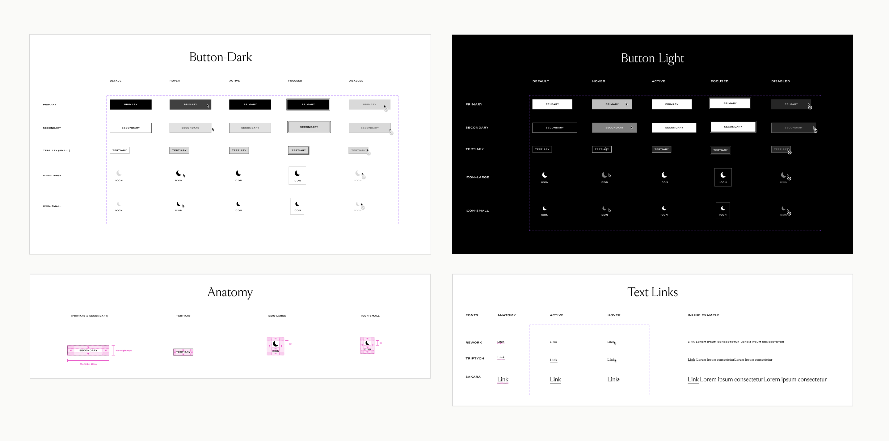
We used the same approach for the Inputs and Fields; we accounted for all possible states whilst streamlining the design to ensure good UX and easy visibility.
.png)
Icons
Sakara has an amazing catalog of iconography and graphic work, so it was important for me to distill those styles into their core elements and design the site icons with that essence in mind. The icons had to match well with the site typography, brand marks and be able to clearly convey meaning from abstract concepts.
.png)
Outcomes and Conclusions
Once the design system was fully fleshed out it became a cornerstone for how we built the newly redesigned Sakara website. This will not only positively impact the user experience but also the efficiency and collaboration among teams! This netted some positive wins and tangible long-term improvements.
- A Single Source of Truth
Sakara now has a comprehensive library to view components, patterns and styles; this can be implemented on all projects moving forward and creates a more efficient, consistent design process and reduces the time needed for QA. - Efficiency on All Fronts
All the guesswork has been taken out of the equation; with the highly detailed specs and descriptions in the system, Engineers will spend less time on coding new components and design handoff will be a much faster process. - Scalable and Future-Proof
The design system can now be iterated on easily and the changes will propagate to other designs instantly. Changes are made and managed at scale and there is a consistent foundation for any incoming designer or engineer to build upon once new components are needed. - Enhanced Collaboration
The new system will facilitate better collaboration between design, development and other cross-functional teams, which allow for a quicker turnaround time and more cohesive teamwork for other projects moving forward.
As with any design system, it's constantly evolving as Sakara's business needs and the needs of its users evolve in tandem. With this, Sakara will have the foundation necessary to build new projects easily, effectively and efficiently.