
Shangri-La Circle
Modernizing Shangri-La's Membership Programme
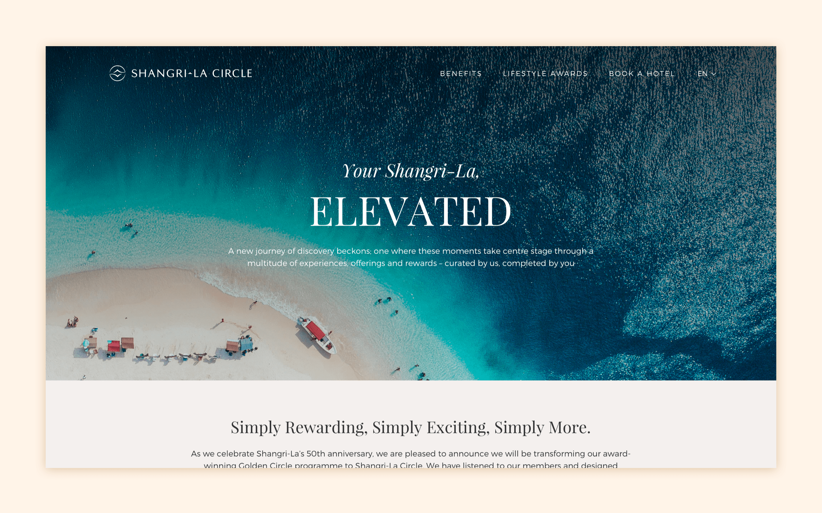
Shangri-La Circle's new digital platform is a fresh new take on the luxury hospitality experience, bringing one of the world's most premier hotel groups into the forefront and exemplifying its longstanding reputation as a desirable destination and leading the way into the post-pandemic era.
The Challenge
Shangri-La's rewards membership program, Golden Circle, has been around for several years and their digital platform lacked a modern aesthetic and suffered from a suboptimal user experience, hindering the growth of sign-ups. The goal was to revitalize the design, infusing it with a contemporary look and feel, while simultaneously optimizing the user journey to increase membership subscriptions.
The Process
Having worked with the Shangri-La Group for several projects, I had a good rapport with their team and a keen understanding of what their management was looking for and what their core user base prioritized. I worked closely with their brand and marketing teams as well as their acquisition and retention teams in order to unearth the full scope of what was necessary to make the project successful.
- Research and Validation
We conducted thorough research to understand Shangri-La's target audience, both existing and new. We identified pain points, areas of improvement, and a wishlist of features, perks and quality of life improvements that would endear users to the platform. We also orchestrated a competitive analysis of similar loyalty programs within and outside the industry to identify design trends, successful user engagement strategies, and best practices for showcasing membership tiers and benefits. - Design and Direction
We outlined a new information architecture to streamline the user journey, and developed wireframes to ensure clarity of the layout and flow. We also worked closely with the Shangri-La brand team to help translate their new visuals into a digital space. With the initial research conducted, we implemented UI/UX best practices as well as other key features that were found to be successful in other platforms. After the initial design phase, we created high-fidelity interactive prototypes to test and validate our designs with various audiences. - Collaboration and Stakeholder Management
As I had worked with Shangri-La for a multitude of projects, including a few of their e-commerce platforms and various websites, I had an established relationship with many of the key stakeholders and an understanding of their vision of the company's future. With that in mind, it was important for me to uphold a collaborative environment and manage unified alignment with all teams and stakeholders as this was one of the biggest overhauls of Shangri-La's digital platforms, and there were plenty of conflicting opinions that needed to be managed and resolved.
Solutions and Keys for Success
- Simplified Sign-Up Process
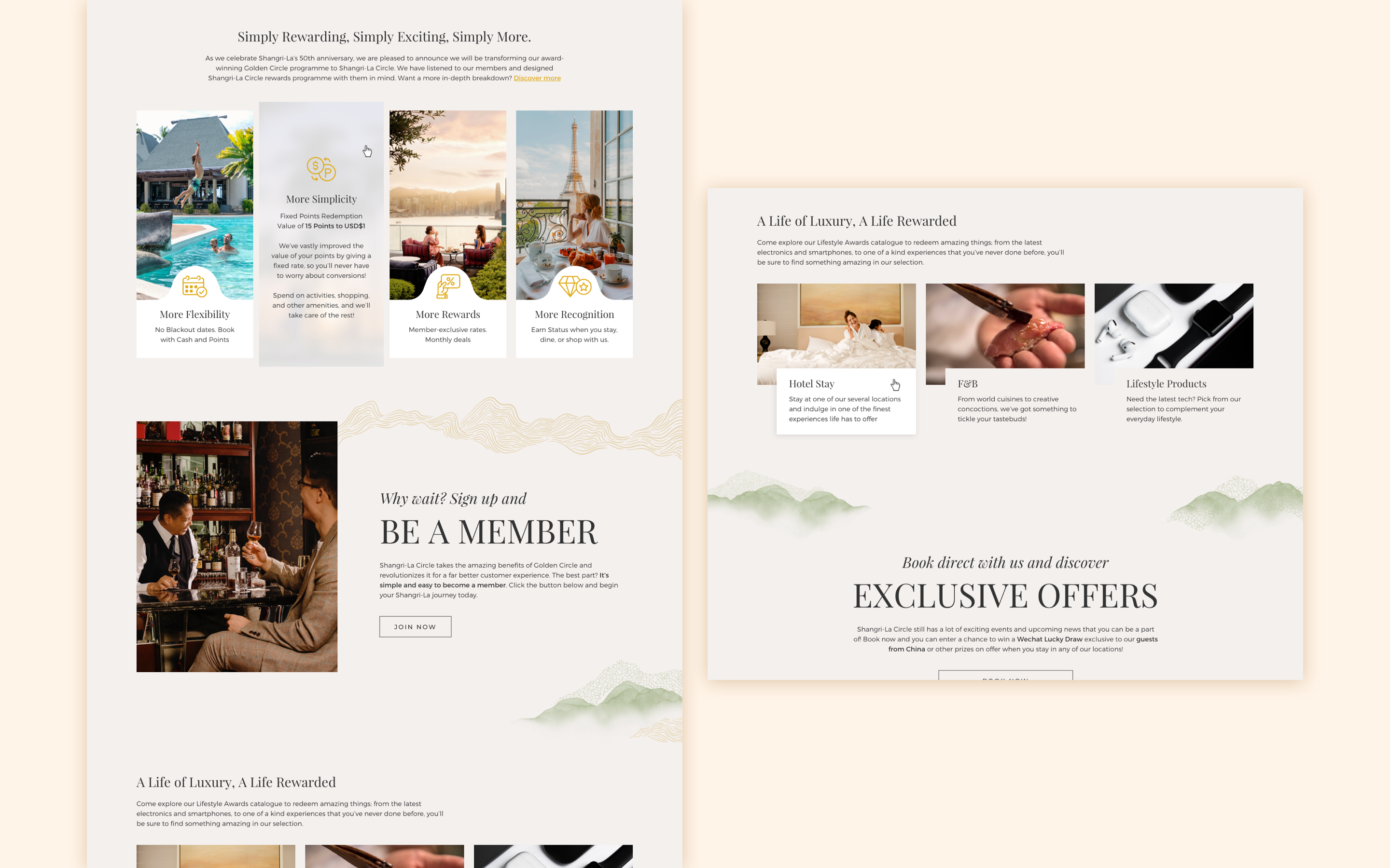
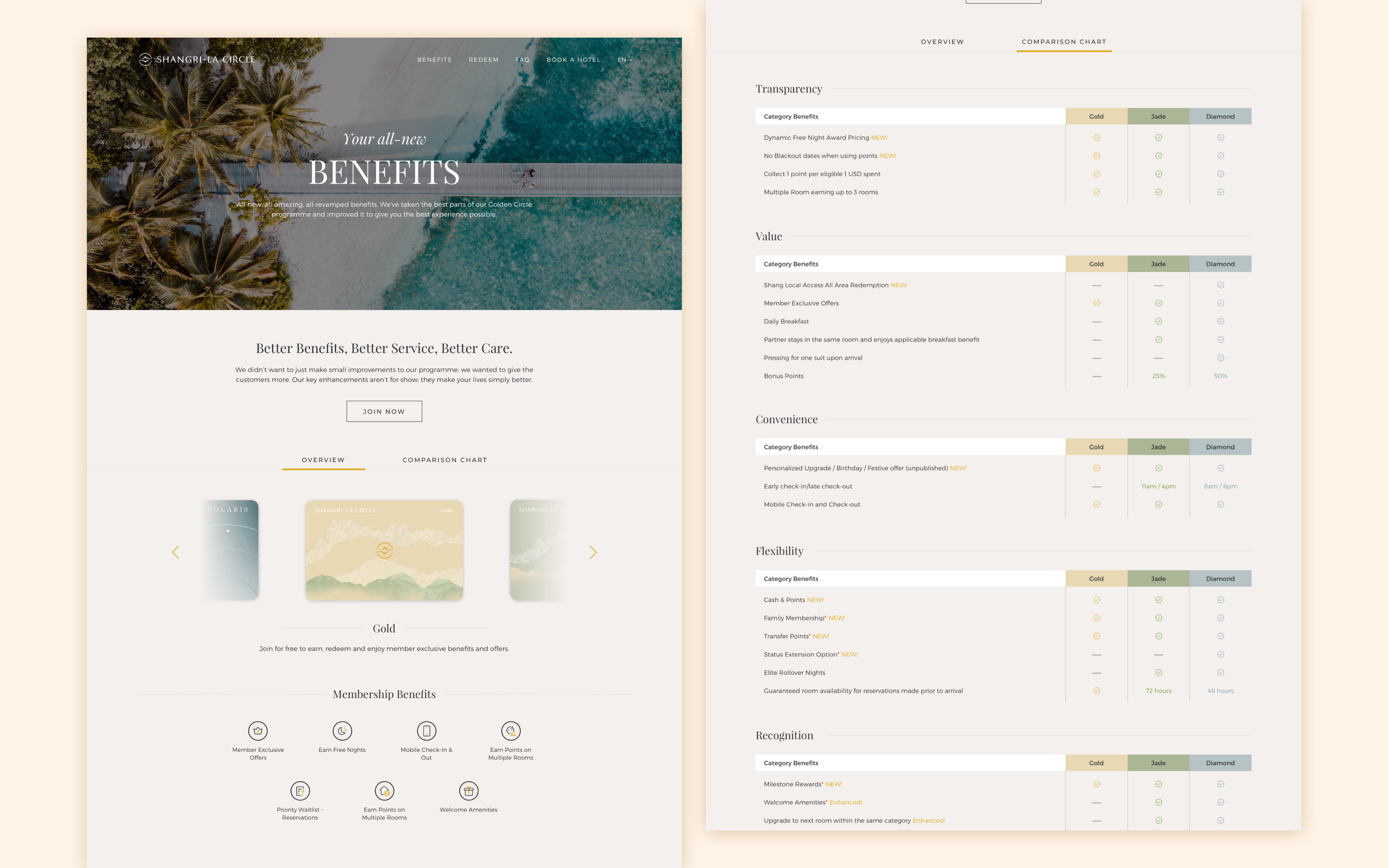
Streamlined the membership sign-up process, reducing friction and encouraging users to join with minimal effort. - Clear Tier Information
Clearly presented each membership tier's benefits, distinguishing them through iconography, responsive table designs and concise descriptions for easy comprehension. - Engaging and Exciting Visuals
Utilized animated interactions, stunning photography and a sleek utilization of Shangri-La's refreshed brand identity into the digital platform, capturing the users' attention and highlighting the key information and values of each membership tier and the overall benefits. - Mobile-First Design
With the density of information provided on the site, it was imperative to provide an optimal user experience on mobile devices to ensure users would be able to glean the information clearly and easily. We wanted to make sure that there were no compromises, regardless of the platform that the user was engaging the site with.
Metrics Improvement
After launch, we were able to gather key data that informed us of the positive impacts of the site as well as any potential directions that we needed to take for future improvements or development of net new features:
- Increased Sign-Up Rate
Once the site was launched, we were able to see a marked improvement of the sign-up rate by 30-35% within the first month. This kickstarted a renewed interest in the Shangri-La brand, leading users into the company's other websites and platforms and improving overall engagement as we were led into a post-pandemic era of travel - Overall Improvement in User Satisfaction
We received positive feedback from existing and new members, indicating improved satisfaction with the revamped Shangri-La Circle Membership experience. Feedback included a notable ease of accessibility and comprehension of the membership program and the benefits per tier, as well as delight in the refreshed visuals, highlighting Shangri-La's vision for the future.
Conclusion
The project emphasized the importance of balancing aesthetics with functionality. Iterative design, driven by user feedback, proved essential in achieving a user-friendly and visually appealing Shangri-La Circle interface and experience.
The redesigned website not only achieved the goal of modernizing the program but also resulted in a substantial increase in sign-ups. The project highlights the successful implementation of contemporary design principles with strategic UX decisions to drive tangible business outcomes.
The Shangri-La Circle case study is a project that I'm particularly proud of, as it was one of the last projects I was able to make with their team prior to moving to my new role. I was able to stand together with the stakeholders, from the teams I directly collaborated with all the way up to the C-Suite executives, and enjoy the successes of the project's launch.